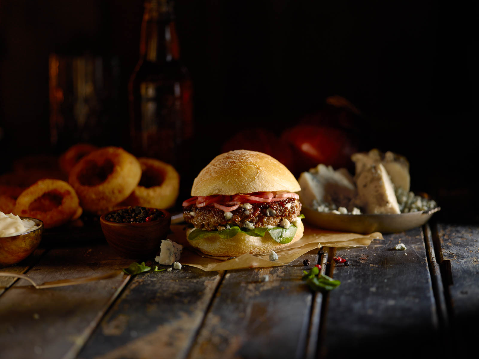
We just captured some amazing burger images using natural light for Cargill, with art direction by Blacktop Creative. The stylist was Sarah Hunt, and she did an incredible job of bringing each burger to life. The hero of the show for me was the lighting. We worked incredibly hard to create a tiny aperture to let light spill directly on the burger while masking the rest of the scene off almost entirely. I love the end result.
Blog
A food blog dedicated to the Kansas City commercial photography studio - Alistair Tutton Photography
Making a Mess!
I love working with liquids and we’ve been doing a lot of test shoots in the studio recently so we decided to try and combine those techniques. This shot focused on creating the same backlit glass work you can see on the Johnny Walker bottle and glass and on the wine bottle image. but mixing in the dynamic of the splash. This meant utilizing a similar lighting strategy but with totally different strobes. After several tests we got a result we simply love.
Well done to Bill and Adam on some great retouching to combine three frames - one for the spill, one for the pour and one for the glass contents.
Credits:
Photographer: Alistair Tutton
Assistant: Adam Caselman
Retoucher: Adam Caselman and William Hess
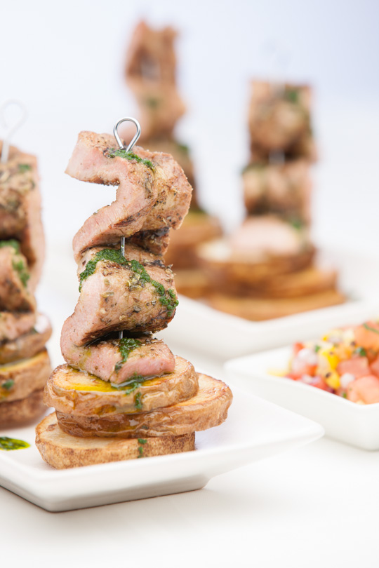
Since our first shoot with Farmland last year (check it out here) we’ve had a few more great opportunities to work with them including this one for a tasting Farmland participated in. The theme was “Tastes of the World”; and Trina, Chip and I had a really fun time tracking down a whole host of props to make a fun set of images.
Each of the food dishes was meticulously planned by Farmland and we worked really hard to pair those dishes with the props and I’m very happy with the results.
Credits:
Photographer: Alistair Tutton
Client: Farmland Foods
Art Director: Chip Morgan
Assistant: Adam Caselman
Retoucher: Adam Caselman
Food Stylist: Trina Kahl
Client: Farmland Foods
Delicious Retouching
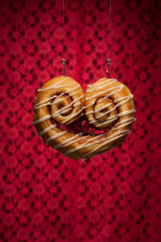
Seriously, I want a cinnamon roll every time I see this image. With the help of Dolce Bakery, we put this shoot on for a class from the Art Institutes of Kansas City. Several steps went into getting all of the aspects ready for the retouching side of this shoot. We had the heart shaped cinnamon roll suspended from fish hooks in front of a material background. A softbox was above the cinnamon roll, and a black flag was underneath. The third fishing hook you see on the bottom of the cinnamon roll was used to keep the roll parallel to the camera. Then we had to photograph the arrow in three different sections. That’s right. The arrow never went through the cinnamon roll all at once. Alistair took a grinder and chopped the arrow into three parts and they were photographed at different times. Then, the crumbs were photographed falling in mid-air.
Alright, now for the heavy lifting in Photoshop. Everybody stretch. I don’t want you pulling a hamstring.
The first thing I had to do was to separate the cinnamon roll from the background so that I could manipulate the shape without affecting anything else. Then, once I had that done, I could clone out what was left from the fishing line on the bottom of the roll. The delicious looking goo in the middle of the roll had to go, so I masked that off since I had the cinnamon roll on it’s own layer. Then, I got to use a tool that I rarely get to use. I knew of it, but haven’t had much use of it until now. I think I even had to look up a tutorial online to remember how to use it. That tool was….the puppet warp tool! The puppet warp tool has awesome capabilities if you’ve never used it. It was especially useful in this situation. The cinnamon roll had a good general shape of a heart, but I needed to shape it even more. I remembered that there is a heart-shape in the custom shapes tool, so I made a heart shape over the cinnamon roll and reduced the opacity so that I could see how I was shaping the roll. I put my points down and shaped the heart until I was happy with how it looked. Then, I had to put in the arrow pieces. It was a bit tricky due to shading and depth, but I think it turned out quite nice and believable. For the icing being flung out of the “exit wound”, I had to create that from scratch in Photoshop. Using the pen tool and layer styles I tried to imagine how icing would behave if it really were being flung out of a roll. I think it works. Oh, the icing on the arrow was already there. I didn’t create that. Ok, that’s it. I need a cinnamon roll now. I’ve typed it too many times not to have one.
- Adam
I loved working on this shot with Adam and Erin, from Dolce. We chatted with the students from the Arts Institutes about what they wanted to see and the feedback was a studio shoot, with food and plenty of retouching…so we came up with this. The idea is based on a really popular Valentine’s item for Dolce - their double-rolled cinnamon rolls. We brought in a couple dozen rolls to find a hero and went to work.
The final result was definitely a complete collaboration between me, on the camera, and Adam, on the computer. We actually left the set up for twenty-four hours to be sure we had exactly what Adam would need and lucky we did! We ended up coming back for one additional shot utilizing the arrow to get the best shadow detail possible as the arrow entered the roll (the original was just too clean).
- Alistair
Credits:
Photographer: Alistair Tutton
Assistant: Adam Caselman
Retoucher: Adam Caselman
Food Stylist: Erin Brown
Client: Dolce Bakery
Mmmm Pork.
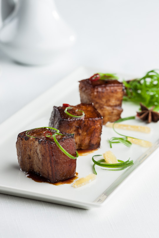
I love working with local companies, and sometimes you don’t realize how incredible some of the local companies are that we have here. So it was an absolute pleasure to hear from Farmland (who we’d been courting for a while) and be given this opportunity to work for them. The shoot was for their brand, spanking new line of DuRoc pork products, that will be sold directly to restaurants. Our task was to style a series of images that would reflect the high-quality style of restaurants that Farmland wanted to target, and to synchronize that with the delicious dishes that Farmland’s in-house team devised.
I love the final result and it’s even more inspiring to see it in use by Farmland in their materials.
Credits:
Photographer: Alistair Tutton
Assistant: Adam Caselman
Retoucher: Adam Caselman
Food Stylist: Trina Kahl
Client: Farmland Foods
Don’t Try To Pull One Over On A Brit.
I’m English. So I know scones. I really know them. And these scones from Dolce Baking Company are the most incredible scones ever. Ever. You should try them with a cup of tea. Crumbly, yummy goodness.
Credits:
Photographer: Alistair Tutton
Assistant: Adam Caselman
Retoucher: Adam Caselman
Location: Dolce Baking Company
Everyone Screams For This Ice Cream…and Cookies.
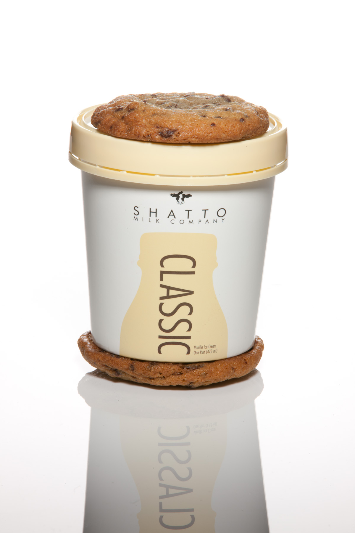
Shatto rocks! And then you add Dolce Baking Company to Shatto and I guess you get rocks squared - so there are these fabulous new Ice Cream Sammiches that have been on the market for a little while…and apparently are fully addictive. They taste delicious and as always we worked with SHS to get photographs of their latest packaging design for Shatto. Here are the results.
Credits:
Photographer: Alistair Tutton
Assistant: Adam Caselman
Retoucher: Adam Caselman
Client: Sullivan Higdon and Sink
Client: Shatto Milk
Client: Dolce Baking Company
Hungry???
I have no idea how to make a cinnamon roll, let alone a roll as incredible as the one’s that Dolce Baking Company makes. They are a-mazing. So here’s a beautiful step-by-step series of photos of how to make the most a-mazing cinnamon rolls ever.
Enjoy!
Credits:
Photographer: Alistair Tutton
Assistant: Adam Caselman
Retoucher: Adam Caselman
Location: Dolce Baking Company
Fun with Fireworks!
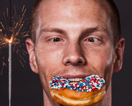
Adam and I were looking for a fun way to celebrate the 4th of July, so we decided to set off some large smoke bombs and fire of some sprinklers…luckily we only set the backdrop on fire once.
Also, Adam really can cross his eyes like that…the things we learn at work.
Credits:
Photographer: Alistair Tutton
Assistant: Adam Caselman
Retoucher: Adam Caselman
Friday Is For Cakes!
I love cakes! That is all. It is absolutely amazing knowing the people at Dolce and the best part is we not only get to take photos of something this beautiful, we get to munch on them.
Yum.
Credits:
Photographer: Alistair Tutton
Assistant: Adam Caselman
Retoucher: Adam Caselman
Location: Dolce Baking Company
Sometimes Photography is Yummy.
I can remember the day I heard that Shatto Milk Company was launching a line of ice cream sandwiches. I knew they were going to be marvelous and I fully enjoyed being a part of this tasty debut. The sandwich packaging was shot on white seamless, so all that was required on the background was a bit of cleanup and some level boosting. The shadow from the packaging gave the sandwich some dimension, so it was left in. Some of the packages needed to have the creases taken out or reduced, so there were compositions used for that task. Some careful manipulation was used to align the packaging comps that didn’t line up perfectly. Yay liquify tool!
The shot of the ice cream package in between the two cookies was a result of combining three images. The cookie wasn’t large enough to cover the whole top of the package, so I blended all three positions of the cookie to create one big one. It wasn’t too hard because the texture and color of the cookie was fairly easy to blend. The last thing to remove was the reflection coming off of the plexiglass. It was easy since the ice cream and cookies were shot on white. Simple and sweet!
Credits:
Photographer: Alistair Tutton
Author: Adam Caselman
Retoucher: Adam Caselman
Assistant: Adam Caselman
Client: Sullivan Higdon and Sink/Shatto Milk
Ask More Questions Than You Think You Should.
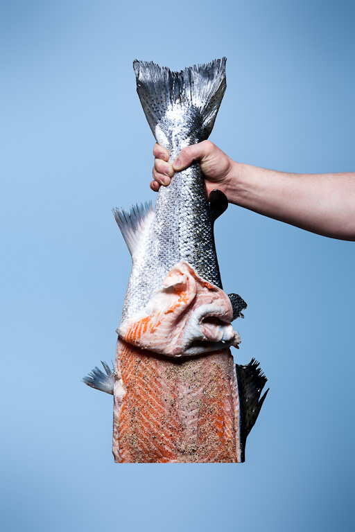
One can never overlook the importance of details. It’s always better to ask as many questions as you need to get the details that will help you do your job more effectively. When you don’t ask enough questions you wind up assuming things, which is essentially guessing at important facts. This never ends well. Whether you are bidding out a job, planning out a shoot or working on marketing it’s always imperative that you ask questions. Trust me the aggravation you encounter from the person you are asking questions of is no where near the disappointment, anger or exasperation that being ill-prepared will cause. So ask away.
A good example involves the shot above. We were at the end of the shoot for this lovely piece of salmon and had gotten what we thought was THE SHOT. And then we opted to ask.. “What would happen if instead of cutting the skin we peeled it back and pinned it?” Well, you know what happened? A MUCH cooler shot than the one we previously thought was THE ONE. So never take anything at face value always dig a little deeper and ask questions.
It pays off.
Credits:
Photographer: Alistair Tutton
Assistant/Retouch/Arm Model: Adam Caselman
Stylist: Trina Kahl
How do you retouch a cup of coffee?
Ahhh, smell that? That’s the smell of coffee brewing and Photoshop layers. This was a shot we did in studio while experimenting with different beverages. Trina Kahl was our food stylist extraordinaire. What might appear to be a cup of espresso is actually a mosh pit of a few images and lots and lots of cloning.
To get the swirls, we shot the coffee as the milk was being poured into the glass. It mixes quickly so you only have a second or two before the coffee and milk merge. I took these shots of the coffee and milk mixing and cloned them over and over. It would have been a lot easier to use the liquify filter to make these swirls look genuine, but because of the design of the glass I had to alter the liquid without altering the shape of the glass. Arrr, photography, she’s a cruel mistress! Oh, and of course the reflection had to be added in after all the swirls were done. I would love to say that I had an exact image in my head, and it was a symphony of retouching, but to be honest, it was a whole lot of trial and error, and what I like to call the “optometrist method”. What is the “optometrist method? You know when you go in to the optometrist’s office and they put that eyesight machine up to your face and ask you, “Better or worse? Better or worse?” That’s what I did with this image. I would manipulate for five or ten minutes, then turn the layer on and off asking, “Better or worse?” Occasionally the image will get worse before it gets better, but that’s for another blog post.
Sometimes an image is retouched without an exact destination. Alistair knew what he did and did not want out of the image, and that was enough for me to create this delicious composite. Excuse me, I think I’m going to go make myself a cup of coffee.
Credits:
Photographer: Alistair Tutton
Food Stylist: Trina Kahl
Retouching/Assistant/Author: Adam Caselman
Nutella = Yummy
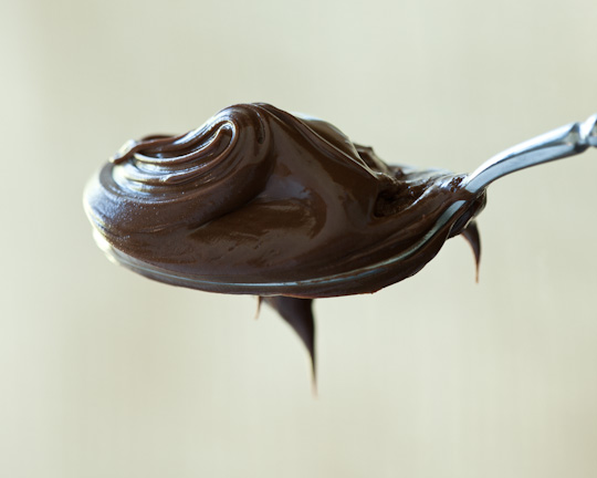
So we’ve been doing a lot of images in the studio with strobes, and so today we decided to play a little with our windows. You may not have had a chance to taste Nutella - it’s one of those European things - but if you see it, buy it, spread it, eat it. It’s yummy.
When Showing the Portfolio.
The oddest things can happen - I’m always certain to meet incredible people and see some of the most beautiful, creative offices around the country. But without a doubt my favorite was this year when visiting Campbell Mithun. Yep, this is a photo of me in a soundbooth, doing a voiceover for the agencies entries into “The One” show. I have to admit that while my silly accent has proven very entertaining over the years I’ve spent in America, this was the first time I actually had someone choose to record it for posterity - thanks go to Kat Dalager for a very entertaining time.
Credits:
Kat Dalager, Campbell Mithun
Our work….in print. Always cool.
Tearsheets are pretty darn fabulous and we had some odd ones last year - ranging from priests, to hangover cures, professional football (soccer for you American folk) and the architects and union workers who build the stadiums and even a clock maker who restores historic clocks - the really big ones. I love the variety of the projects we get to cover, and while I do have my favorites it’s phenomenal fun to be working with so many wonderful subjects.
Credits:
Room 39
Sporting KC
Populous
Architect Magazine
Historic Preservation Magazine
Columbia Magazine
Assistant - Adam Caselman
Why do I do it…
So I typically use the blog to show off the new images, so I wanted to try and post some stuff that’s a little less shoot based and a little more me based. I occasionally get asked “how did I end up here”, pretty much all the time - it’s the accent I think - and while it generally relates to me being in America and talking in a strange way, I think it could equally relate to my photography. So yeah, how did I end up here. I started off in a very different direction; I was going to be an architect, like my father, and wound up doing an exchange program to the University of Kansas - there’s a long story there - and then wound up designing retail interiors and exhibits all over the country - several long stories there. I loved it, it was a really cool job with some really exciting projects…and then I started photographing them.
That was that.
I just bought a camera from Best Buy, and twelve months later I was done, I chatted to some wonderful full-time professionals, who critiqued and advised and helped me adopt the best practices. I went to the library and read, I picked up the camera and practiced, I looked and looked, at my work and other people’s work and then just walked out.
So why?
I love the camera, I love the physical nature of capturing that fragment of time, that moment, I love the technique, the multiplicity of options to solve almost any visual option. I love the incredible range of styles.
That’s why I do it.
So I take a lot of photos, a lot of photos, and sometimes I get asked what my favorite image was. Last year I finally had time to go home at Christmas and see my family for the first time in four years…yep, it sounds soppy but my favorite image was this outtake that really took things full-circle for me. There are some images I want to frame, some I want to frame and have in the house, but I don’t have many images that make me this happy.
Credits:
Mum and Dad
Here’s the rub….Part 2
Part two of our mailer campaign recently went out and again, thanks for the ongoing feedback. On this one we opted for a postcard mailer so we could show off the artwork a little larger. This time we opted to use the rub as a hair tonic with my good friend (and fellow photographer) Phil Peterson stepping in to model for us. Also, that’s Kate’s hands are doing the rubbing. On the food - Trina prepped a beautiful tied pork roast and this was one of those occasions where we got to eat the props - we finished shooting this one just before lunch and without any obscure adulteration to the food Trina finished it off and we just sat down to reflect on a great shoot. Thanks to Sarah Thompson Lift who styled the head rub shot and made sure Phil left with his eyesight in tact - safety first.
Part three is coming up next. I hope you are enjoying the images.
Credits:
Food Stylist - Trina Kahl
Stylist - Sarah Thompson Lift
Assistant - Adam Caselman
Here’s the rub…
So it’s been a while since we last did a physical mailer, so we knew we had to come up with something that would stand out, amuse people and show off some really nice images. We were coming into Spring and Valentines Day was just around the corner, so we figured we’d make it a gift, with a twist. Kate, our resident genius, came up with the double entendre of a meat rub - so we could show some portraiture and some food imagery with a twist - in this case we went for “Give your meat a little rub…THIS MEAT” as the copy and went with a good old fashioned Kansas City strip for the meat. Thanks as always to Trina Kahl and Sarah Thompson for their fabulous styling skills as well as Chris Galloway our perfect “find” from Kate’s morning workout at the gym. We heard some great feedback on the mailer and apparently there was a lot of use of the included BBQ rub. This is part one of a three part series - so get ready to see some more wonderful imagery soon.
Credits:
Food Stylist - Trina Kahl
Stylist - Sarah Thompson Lift
Assistant - Adam Caselman
Some fun with syrup.
Recently I got approached by the wonderful Layne Haley to take some photos with her. Layne’s one of those collaborative artists who like to create work for fun - I like that. So she wanted to photograph some waffles and make some yummy in-studio photos. So that’s what we did. The big question now is what are we going to work together on next?
Credits:
Layne Haley
Assistant - Adam Caselman


