Blog

A food blog dedicated to the Kansas City commercial photography studio - Alistair Tutton Photography

tumblr_mjgznx8WAj1rxs0kmo2_540.jpg
tumblr_mjgznx8WAj1rxs0kmo1_540.jpg

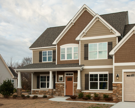
Here is a shot we did where the client requested to have part of the siding replaced on the house. I kind of have to laugh at myself, because when the client asked if it was possible in Photoshop, I said, “Yeah, I can do that.” I spent the rest of the shoot thinking, “How am I going to do that?” Luckily, the client sent over some samples of the siding that they wanted to replace the old siding with. It wasn’t a big sample. In fact, I had to spend about an hour building up a pattern big enough to use on an entire side of a house. It had to be smooth enough that you couldn’t tell where the seams were, and the shake had to be in scale to the rest of the house.

After I got that done, it was time to map the pattern on to the house. The pattern that I had built so far was a straight on shot. There wasn’t any angle or depth to the pattern. So for each shot I had to give the pattern the same perspective as the walls of the house. Then, the overall contrast had to be matched to fit the lighting scenario. After that, shading had to be done to make the pattern not so obvious. The color even had to be matched to a specific color. I believe some sky was added in for texture, and grass was brought in over the dead grass that was originally there. For something that doesn’t look so complicated, it sure wasn’t easy. 

- Adam

This was a really fun trip out to North Carolina - I love our road shoots. We had a stunning set of houses in a brand new development; the weather was a little tricky, so we had to get lucky on a couple of occasions with some gaps in the clouds. But the much bigger problem was that siding wasn’t exactly what the client wanted…and the grass was completely dead (but that’s an easier fix)…so Adam got to really work through some crazy steps to make the exteriors perfect. And of course this was on a tight deadline for a trade show ad. I’m really happy with the result.

- Alistair

Credits:

Photographer: Alistair Tutton

Creative Director: Dave Swearingen

Art Director: John Stephenson

Assistant: Adam Caselman

Retoucher: Adam Caselman

Client: Ply Gem

Agency: Blacktop Creative

tumblr_mcv5wf12M41rxs0kmo2_540.jpg
tumblr_mcv5wf12M41rxs0kmo1_540.jpg

When Weather Won’t Cooperate.

Through rain, clouds, wind, and more rain, professionals stick it out and get it done. This shot for Ply Gem in Virginia happened to be photographed on a rainy day. We managed to sneak in a few angles between the showers, but there was quite a lot to do on the retouching end because of that. In order to make this image look like it was shot on a bright and sunny day, a sky had to be dropped in (obviously). That was a bit of a challenge because of all the leaves overlapping the sky. The color temperature needed to be shifted, the windows had to be colorized, the grass had to be replaced, a new driveway was dropped in, the tree on the left had to be lightened up considerably, and handles on the garage doors were comped in as well. There was a total of about 6-7 hours of retouching in this one shot alone. There are times when mother nature just doesn’t let you get what you want in camera. 


Credits:

Photographer: Alistair Tutton

Assistant: Adam Caselman

Retoucher: Adam Caselman

Author: Adam Caselman

Client: Ply Gem

Client: Blacktop Creative

tumblr_m5j85oCEBl1rxs0kmo1_1280.jpg
tumblr_m5j85oCEBl1rxs0kmo2_1280.jpg

A Little Photoshop Makeover

Our retoucher, Adam Caselman shares a unique perspective on post production.

Here was a situation where the conditions for making a beauty shot were a little less than awesome, so I gave it a healthy dose of Photoshop. This is a shot from a project we did in Washington DC for Ply Gem. There was quite a bit to do on this photo, and I remember sitting in my chair looking at this thinking, ‘Where do I start?’ I think the best approach is to just pick the most obvious thing, make it look fantastic, then move on to the next thing. Just about everything in the image has been worked on in some way, so put on your gloves kids, we’re about to get messy.

The most obvious things to me were the basketball pole, the 'Case’ pole just to the left of that, the zig zag gutter in the middle of the frame, and the mailbox on the left. Everything must go! While these tasks weren’t like flipping on a kitchen light, I luckily had enough material around the objects. The challenging part of taking these objects out was cloning the siding of the house and keeping the pattern believable. The mailbox and the 'Case’ pole weren’t hard to deal with, but the basketball goal and the gutter were tricky.

Now that the cloning was done, I felt like I could take on the house. The large tree on the left was shading the left side of the house, so I had to lighten the left side and even out the tone. The tone gradually changed from right to left on the house, so I had to do my best to match that, lots of feathering. Then the color of the shutters had to be bumped up. Easy enough.

Next came the grass, which I had to bring in from a shot we had on hand that we use for cloning in grass. Grass can be very tricky to match. Special attention needs to be given to the time of day when putting completely new grass into a scene. Even the contrast of the grass needs to be correct for the time of day, or it won’t be convincing. The driveway needed replacing, and in an amazing coincidence Alistair came back the day I needed a new shot for it with a nice clean shot of a driveway, almost like it was meant to be.

The last piece was more challenging than I originally thought, the sky. I was able to replace the sky without too much painting. I used a series of contrast and color selections. Those techniques saved me what might have been hours in painting. Phew! I’m really pleased with how the image turned out, especially the cloning. I’ll admit to smiling when I flick through the before and after shots. I hope the client did too.

Credits:

Photographer: Alistair Tutton

Assistant: Adam Caselman

Retoucher: Adam Caselman

Author: Adam Caselman

Client: Ply Gem

Client: Blacktop Creative

winner of the 2012 pdn photography award

tumblr_m50ujvBzAJ1rxs0kmo1_400.jpg
tumblr_m50ujvBzAJ1rxs0kmo2_540.jpg
tumblr_m50ujvBzAJ1rxs0kmo3_540.jpg
tumblr_m50ujvBzAJ1rxs0kmo4_540.jpg
tumblr_m50ujvBzAJ1rxs0kmo5_540.jpg

Ever since I started my journey into photography I’ve been an avid reader of PDN. For me it’s the primary source of news and advice for almost all aspects of the commercial photography industry - ranging from advertising photography, to photojournalism, to fine art and wedding photography and pretty much every thing in between. It’s read by a lot of photographers and a lot of art buyers. The magazine runs a few specialized competitions - chief amongst them the “Photo Annual”, their annual photography competition. It’s a pretty big deal, from what I know.

So we did the usual thing of entering a couple of pieces (I think we entered last year as well) and you know what’s really weird and unexpected and quite wonderful? We actually won - we’re amongst the winners! We’re actually going to be published in PDN. That’s right, the magazine I love is going to actually feature a photo of mine. Yep, it’s in the June issue, out any day now (the on-line version is out and apparently it’s page 77 if you want to take a look). And having had a brief look through the on-line work the other images are absolutely breathtaking; and it’s an absolute honour (British spelling of course - we’ll talk about aluminium next) to be amongst folk like that.

I’m kinda shocked, I have been for a couple of months since we heard. We’ve been holding off on chatting about it until we saw it on the on-line version. And we got an email the other day saying we can feature the fancy graphic below and I get to go to a party in Manhattan - the fancy one - to meet the other winners - this is kinda cool.

Needless to say I’m “chuffed to bits” and pretty humbled to get this sort of recognition. I know that Kansas City’s had a lot of attention from PDN over the years - David Morris was featured for his really cool blackboard image this year. Austin Walsh had that wonderful Christmas video in there last year and, most ironically, The Wade Brothers are on the facing page to me this year - congrats lads. I’m sure they are others as well but this, for me, is pretty darn amazing!

So what did we win for? It was a really cool project that we worked on with Blacktop Creative and Ply Gem. We’ve done several projects for them over the years documenting their exterior home products. For this project they teamed with Extreme Home Makeover and donated all the exterior finish products for all seven of the homes they built in seven days for their Joplin Christmas Special. It was an incredible donation by them and a pretty emotional project to work on. The homes were incredibly unique and we were charged with capturing overalls and individual details of each home. Over the course of several days we worked on all the different aspects that Ply Gem had delivered. We had, honestly, some bloody awful weather. That meant we were on location for long periods, up well before the dawn, trying to get that perfect moment and we definitely found some gorgeous images of the homes. One angle we settled on immediately was a front elevation shot with a really dominent portion of sky in each image to make a set where the unique designs would hang together as a set. For this series we had a really short gap of good weather, and we literally ran down the street to get each image in as nearly identical lighting as we could get.

Thanks to everyone for all their hard work on the project - it was a really fun set to be on and the co-operation with the film crew was wonderful. The final result had some real meaning for a wonderful group of families.
Credits: Ply Gem, Blacktop Creative, Dave Swearingen - Creative Director, Adam Caselman - Assistant

Extreme Home Makeover - Joplin Style.

Sometimes you get to photograph a subject that truly moves you - and in this case it was seeing Joplin and getting to witness part of the rebuilding effort. Ply Gem is a long-term client of mine who I have helped build a library of case studies featuring their windows, siding, fencing and a myriad of other products.

For the Joplin Extreme Home Makeover they donated all the windows and siding for all seven houses and the result was a stunning set of case studies for them, but more importantly seven wonderful homes for some very deserving families. Joplin has had a really rough run of it, but they are definitely heading in the right direction.

PS Best place to donate is the Red Cross and select Joplin as the destination for your donation - they’re doing some wonderful work there, but there is an incredible amount of rebuilding left to go.


Credits:
Ply Gem
Blacktop Creative
Art Director: Dave Swearingen
Assistant: Adam Caselman

George Weyrauch: Blacktop Creative

George and I recently collaborated on a “Lunch and Learn at the Kansas City chapter of the AIA. It was a wonderful experience; from drafting the presentation to actually delivering it in person I really enjoyed working with George and I really appreciate his ongoing support (especially now I’m shooting for Blacktop).

"How many photographers do you know that can stand in front of a professional organization as a photographer and speak to branding? In first Q08, I had the pleasure of preparing and presenting a speech to a large group of professionals at Kansas City chapter of the AIA on ‘Branding and Photography’ and I was blown away by how as a photographer, Alistair gets branding!”

“I have been in this wonderful world of Advertising for over 20 years and have only on a few occasions met a photographer that when hired to do a photo-shoot for a client wanted to understand the brand first before he ever looked into the lens. He captures and promotes, visually, the brand of each client that he works for. Alistair is an ultimate professional and an incredible person to work with. If you have not taken the time to see his work, do it now at www.alistairtutton.com.”

“George Weyrauch, Director Business Relationships
Blacktop Creative”

Credits:
Blacktop Creative

Westlake Ace Hardware - Blacktop Creative

In the start of a year long project we spent a long night making a beautiful Westlake Ace Hardware store absolutely perfect. We tweaked and teased it and showed it in just the right light to ensure that the new signage, designed by Blacktop Creative, would be shown in context. Throughout the year I’ll be capturing new signage and merchandising set-ups as the seasons change and new ideas hit the shelves.


Credits:
Westlake Ace Hardware
Blacktop Creative
Art Director - Kevin Garrison
Assistant - Ryan Yoakum and Neil Dekrey