Blog

A food blog dedicated to the Kansas City commercial photography studio - Alistair Tutton Photography

Other Work - ArchitecturaL Photography

So we do a lot of other work beyond food, the next major category of images we capture are architectural photographs. We do this work in a huge variety of locations around the country beyond our home base in Kansas City.

If you want to see a great gallery or architectural images please go here - Commercial Architectural Photography

Interior of the Kauffman Performing Arts Center in Kansas City, MO

Interior of the Kauffman Performing Arts Center in Kansas City, MO

Or if you want to see the whole architectural photography website please check this out - Architectural Photography Website

Home exterior for Ply Gem in Lincolnton, NC

Home exterior for Ply Gem in Lincolnton, NC

tumblr_mnfraiwqlu1rxs0kmo1_540.jpg
tumblr_mnfraiwqlu1rxs0kmo5_540.jpg
tumblr_mnfraiwqlu1rxs0kmo2_540.jpg
tumblr_mnfraiwqlu1rxs0kmo4_540.jpg
tumblr_mnfraiwqlu1rxs0kmo3_540.jpg

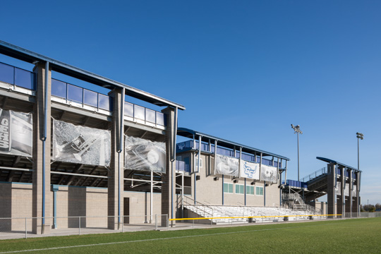
This was a quick project capturing a new set of bleachers for a local high school. The bleachers were really cool that in addition to the press rooms, the changing rooms and the concessions, it also featured a backside for a soccer pitch so they could run two events simultaneously. We had a beautiful sky for the early morning East facing elevation and we actually wound up using the sky in some other projects. I always love some great looking clouds.

Credits:

Client: DLR Group

Photographer: Alistair Tutton

Retoucher: Adam Caselman

tumblr_mnfr6jE3UV1rxs0kmo5_540.jpg
tumblr_mnfr6jE3UV1rxs0kmo2_540.jpg
tumblr_mnfr6jE3UV1rxs0kmo1_540.jpg
tumblr_mnfr6jE3UV1rxs0kmo3_540.jpg
tumblr_mnfr6jE3UV1rxs0kmo4_540.jpg
tumblr_mnfr6jE3UV1rxs0kmo6_540.jpg

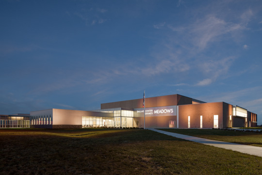
This was another lovely trip to Iowa for DLR Group (highlight, apart from the cool project, was the Drake Diner downtown - that was a fun breakfast!). We faced down some horrendous weather while waiting for a break in the clouds and eventually captured the stunning dusk shot with a lot of extra lighting by us. The interiors were great fun and the kids really worked with us to bring the architecture alive.

Credits:

Client: DLR Group

Photographer: Alistair Tutton

Assistant: Adam Caselman

Retoucher: Adam Caselman

tumblr_mneuicS6as1rxs0kmo1_540.jpg
tumblr_mneuicS6as1rxs0kmo2_540.jpg
tumblr_mneuicS6as1rxs0kmo4_1280.jpg
tumblr_mneuicS6as1rxs0kmo3_540.jpg

East Coast to West Coast - Fun.

After Miami we got to fly across the country and landed in Anaheim for the second part of the shoot. This time we got to work with Jeff in person and it was wonderful to meet up with him again. The store was located in the shopping mall section of Disneyland, so we got to work “on-stage”, but only after hours. Totally different concept store, but still a whole bunch of highly reflective surfaces to contend with and some beautiful design work. 

Fantastic stores and a crazy travel trip - definitely a highlight of last year.

…the end.

Credits:

Client: Sunglass Hut

Art Director: Jeff Fisher

Photographer: Alistair Tutton

Assistant: Adam Caselman

Retoucher: Adam Caselman

tumblr_mneue6Thq81rxs0kmo4_540.jpg
tumblr_mneue6Thq81rxs0kmo2_540.jpg
tumblr_mneue6Thq81rxs0kmo3_540.jpg
tumblr_mneue6Thq81rxs0kmo1_540.jpg

Sunglasses are sexy…

This is a two parter…just like the shoot. The story behind this photoshoot began about five years before we did it. Originally we met Jeff Fisher when he was at Sprint and worked with him to capture the Sprint flagship store in the Power and Light District in Kansas City. Then Jeff went to Wong Doody and we worked with him to capture the T-Mobile flagship store in Time Square, New York. So when he went to Sunglass Hut we knew we were going to photograph another beautiful retail interior by him. The best part was finding out we were going to photograph two of them! The first location was in Miami, so Adam and I flew out there on a Monday. Although he swears this was an accident, Adam sent my clothes to Tampa - that’s alright, I’ll get him back one day!

We got into beautiful Miami and immediately got some sleep, as we knew this was going to be a long, overnight shoot. The store itself was pretty darn amazing, as per usual Jeff and his people had done some beautiful work. The product was fantastic and we definitely enjoyed playing dress up with some of the more edgy styles. The shoot went through the night and we found a 24 hour cuban coffee place around the corner and treated ourselves to cuban coffees every two shots. We finally pulled up on the dawn exterior and set all our lighting to really emphasis the signage and the architecture and then went back to the hotel for a couple of hours of sleep before part two in Anaheim…

…to be continued

Credits:

Client: Sunglass Hut

Art Director: Sara Sullivan

Photographer: Alistair Tutton

Assistant: Adam Caselman

Retoucher: Adam Caselman

tumblr_mj9o3oeN511rxs0kmo2_540.jpg
tumblr_mj9o3oeN511rxs0kmo1_540.jpg
tumblr_mj9o3oeN511rxs0kmo4_540.jpg
tumblr_mj9o3oeN511rxs0kmo3_540.jpg

Independence…we finally achieved it.

After Garden City we rolled on and went to the other side of the state to Independence, KS (that’s right Missourian’s, there is an Independence in Kansas and it’s home to the incredible Neewollah Festival) and worked on another school. This time the brief was to capture images showing the sensitivity that DLR had shown in renovating an existing high school. Focusing on the entry areas and the transition areas that had been built fresh for the students and again using student to show purpose and scale. 

The tree in the exteriors really make that shot for me - there’s nothing like a true old growth tree to really bring architecture alive. 

The nighttime exterior was the tricky shot, as we really wanted to bring the facade to life; we lit it throughout the entire face of the building and made sure to put some uplight into the tree as well to ensure it was part of the image.

I’m really pleased with the final image, but I’m still wishing I could actually make it to the darn Neewollah festival one of these days…

Credits:

Photographer: Alistair Tutton

Assistant: Adam Caselman

Retoucher: Adam Caselman

Client: DLR Group

tumblr_mjgznx8WAj1rxs0kmo2_540.jpg
tumblr_mjgznx8WAj1rxs0kmo1_540.jpg

Here is a shot we did where the client requested to have part of the siding replaced on the house. I kind of have to laugh at myself, because when the client asked if it was possible in Photoshop, I said, “Yeah, I can do that.” I spent the rest of the shoot thinking, “How am I going to do that?” Luckily, the client sent over some samples of the siding that they wanted to replace the old siding with. It wasn’t a big sample. In fact, I had to spend about an hour building up a pattern big enough to use on an entire side of a house. It had to be smooth enough that you couldn’t tell where the seams were, and the shake had to be in scale to the rest of the house.

After I got that done, it was time to map the pattern on to the house. The pattern that I had built so far was a straight on shot. There wasn’t any angle or depth to the pattern. So for each shot I had to give the pattern the same perspective as the walls of the house. Then, the overall contrast had to be matched to fit the lighting scenario. After that, shading had to be done to make the pattern not so obvious. The color even had to be matched to a specific color. I believe some sky was added in for texture, and grass was brought in over the dead grass that was originally there. For something that doesn’t look so complicated, it sure wasn’t easy. 

- Adam

This was a really fun trip out to North Carolina - I love our road shoots. We had a stunning set of houses in a brand new development; the weather was a little tricky, so we had to get lucky on a couple of occasions with some gaps in the clouds. But the much bigger problem was that siding wasn’t exactly what the client wanted…and the grass was completely dead (but that’s an easier fix)…so Adam got to really work through some crazy steps to make the exteriors perfect. And of course this was on a tight deadline for a trade show ad. I’m really happy with the result.

- Alistair

Credits:

Photographer: Alistair Tutton

Creative Director: Dave Swearingen

Art Director: John Stephenson

Assistant: Adam Caselman

Retoucher: Adam Caselman

Client: Ply Gem

Agency: Blacktop Creative

tumblr_mjfskffYAQ1rxs0kmo1_540.jpg
tumblr_mjfskffYAQ1rxs0kmo2_540.jpg
tumblr_mjfskffYAQ1rxs0kmo4_r1_540.jpg
tumblr_mjfskffYAQ1rxs0kmo3_r1_540.jpg

This is a dusk shot we took for DLR Group in Garden City. This is their high school and it is one of the largest in Kansas. We started setting up and shooting about an hour and a half before the sun was going to set. Throughout the evening, we set close to a few dozen lights in different locations and at different times. I can also remember being very cold towards the later hours of the shoot. Brrrrr! Lousy unpredictable temperatures.

In post, I blended two skies, one from earlier in the day, and one from later in the evening. I comped in a series of images where the lighting was switched up as we placed lights in a series of locations throughout the elevation and comped in for the interior lights in the window on the left side of the frame. I remember running all over that school trying to figure out which room that was. It’s kind of funny now that I look back on it. After all of the comps were brought in, I had some things to clone out. There was a bright spotlight on the side of the building, a couple of security cameras, and dust specks of course.

There is one thing about this image that I wish I could change. The star patterns around the street lights are a bit distracting. I could clone them out, but it would take a while, and there’s got to be a better way! I think it has to be done in camera. I can’t think of any way to get rid of them in post production. Possibly a circular polarizer? I’m open to suggestions if anybody has them.

- Adam

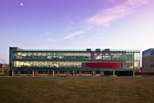
This was one of the main images that the client absolutely had to have done perfectly so they could really show off their design work. They wanted to show off the transparency in the large glazed prow, and so we determined it was best as a dusk shot. We set up the camera and over the course of six hours carefully lit sections of the building to bring out the texture and landscape. As a road trip we only had enough lights to get a section at a time, and then combined those in post for the final shot. The cool thing is that everything you’re seeing was captured in camera, just a lot of work to combine them all.

If you take a look through the images above you’ll see a shot of the building as lit it (mostly foreground and the prow), one of the first frames we captured at the start of the shoot, and the last frame which shows you the actual lighting on the building. This was a really fun shot and well worth those six hours!

- Alistair

Credits:

Photographer: Alistair Tutton

Assistant: Adam Caselman

Retoucher: Adam Caselman

Client: DLR Group

tumblr_mj9nv8K8ui1rxs0kmo1_540.jpg
tumblr_mj9nv8K8ui1rxs0kmo3_540.jpg
tumblr_mj9nv8K8ui1rxs0kmo4_540.jpg
tumblr_mj9nv8K8ui1rxs0kmo2_540.jpg

Western Kansas - it’s Fun, who knew?

Last year we got to work with one of my favorite clients - DLR Group. They do some incredible schools and for this one we got to capture, what we were told, is the third largest high-school in KS. It’s a biggie alright. We had a lot of conversations with Jim French, the lead designer, and Bob Carlson to ensure we knew what the main focus was of the design and how we could record that.

After a six hour drive (across the beautiful flatness they call Kansas) we got to the school and immediately staked out the key shots. The top shot you’re seeing here was the one we decided to capture that evening…six hours later, a couple of pizzas, a stunning sunset, a few dozen well-placed lights we had the perfect shot, and three perfect frames to get the building lit properly…as shown by Bob’s one word response to it - “Spectacular”.

The other critical shot was the student breakout spaces. These areas were incredibly tight, but I really wanted to avoid using something silly like a 14mm to get it in one shot. So we brought the kids in (who were great FYI) and carefully lit the scene to bring out the best in the signage and mezzanine and then arranged the talent and briefed them on what we needed to make the shot work best. Then we stitched the shot together using the really fantastic 24mm tilt to capture two images - one of the mezzanine and one of the ground level. The alignment was perfect and the image looked so much better than going crazy wide could ever have done.

Thanks Garden City for hosting us and thanks for all the help from our talent - this was a wonderful shoot.

Credits:

Photographer: Alistair Tutton

Assistant: Adam Caselman

Retoucher: Adam Caselman

Client: DLR Group

tumblr_mcv5wf12M41rxs0kmo2_540.jpg
tumblr_mcv5wf12M41rxs0kmo1_540.jpg

When Weather Won’t Cooperate.

Through rain, clouds, wind, and more rain, professionals stick it out and get it done. This shot for Ply Gem in Virginia happened to be photographed on a rainy day. We managed to sneak in a few angles between the showers, but there was quite a lot to do on the retouching end because of that. In order to make this image look like it was shot on a bright and sunny day, a sky had to be dropped in (obviously). That was a bit of a challenge because of all the leaves overlapping the sky. The color temperature needed to be shifted, the windows had to be colorized, the grass had to be replaced, a new driveway was dropped in, the tree on the left had to be lightened up considerably, and handles on the garage doors were comped in as well. There was a total of about 6-7 hours of retouching in this one shot alone. There are times when mother nature just doesn’t let you get what you want in camera. 


Credits:

Photographer: Alistair Tutton

Assistant: Adam Caselman

Retoucher: Adam Caselman

Author: Adam Caselman

Client: Ply Gem

Client: Blacktop Creative

Beer :30 Brewery Style
I love dawn, and I love photography, and I love beer…you know what makes me really happy…stunning photos taken at dawn…of a brewery.I’m extremely proud of my adopted home town, and I think Boulevard …

Beer :30 Brewery Style

I love dawn, and I love photography, and I love beer…you know what makes me really happy…stunning photos taken at dawn…of a brewery.

I’m extremely proud of my adopted home town, and I think Boulevard Brewery is an incredible asset of this incredible town. So we were delighted to capture another photo of the exterior of the brewery recording the new expansion and it’s been wonderful seeing it in use by Boulevard.

Credits:

Photographer: Alistair Tutton

Assistant: Adam Caselman

Retoucher: Adam Caselman

Client: Boulevard

tumblr_m9wceqUqbj1rxs0kmo1_540.jpg
tumblr_m9wceqUqbj1rxs0kmo3_540.jpg
tumblr_m9wceqUqbj1rxs0kmo2_540.jpg

Legos and Fish…What Could Be Better?

Another wonderful new addition to Kansas City is this project - a collaboration between ZGF Architects and our long-standing, and wonderful, client, Burns & McDonnell. It’s a beautiful insertion, into a much loved civic space at Crown Center, and Kansas City’s response has been incredible. Thousands of people have been visiting the Lego Land and Sea Life exhibits and it’s a great addition to our offerings to visitors.

Credits:

Photographer: Alistair Tutton

Assistant: Adam Caselman

Retoucher: Adam Caselman

Client: ZGF Architects

Client: Burns and McDonnell

Location: Crown Center

Location: Sea Life Aquarium 

Location: Legoland Kansas City

tumblr_m9fjk1vvWw1rxs0kmo1_540.jpg
tumblr_m9fjk1vvWw1rxs0kmo2_540.jpg
tumblr_m9fjk1vvWw1rxs0kmo5_540.jpg
tumblr_m9fjk1vvWw1rxs0kmo6_540.jpg
tumblr_m9fjk1vvWw1rxs0kmo3_540.jpg
tumblr_m9fjk1vvWw1rxs0kmo4_540.jpg

More Before and After Gems. 

This was a job we did for our friends out in Omaha, Nebraska. DLR Group designed the building and runs their firm in the top two floors. It’s an awesome looking building, and they’re awesome people.

The first image of the building square on was taken very early in the morning, and let me just say that the mosquitoes from Omaha must have found a bottle of anabolic steroids somewhere. It was my job to attract the bugs away from Alistair while he took the shots. I did alright, although one or two might have gotten by me. On the retouching end, I replaced the grass with some grass images we keep in stock just for such an occasion. The building was squared up, the cars were cloned out as well as a light pole right in front of the building, the tone was adjusted as well as a boost of saturation.

The second image had a lot of work to be done. The cars and the light pole right outside the window needed to be cloned out. The light pole took a little time because it crossed over a couple of buildings. The two vents in the floor had to come out. One of them went right under the chair which was fun to clone out. I adjusted the tone in the image as well.

The last shot was a doozy. Again, it was an early morning shot. The bugs were out and biting. Adam Wells from DLR had put out construction cones in the parking spaces the night before so cars wouldn’t be able to park on the street and obscure the view of the building. It worked well, but I think some people were slightly irritated by it. If only they could see the shot and realize the sacrifice they made to produce such an image. The cars in the before image were there when the cones were put out.  All of those cars had to be cloned out, all of the construction cones had to come out, three light poles were cloned out, and the grass was replaced.

This was a very cool project. Good looking building inside and out. 

Credits:

Photographer: Alistair Tutton

Author: Adam Caselman

Retouching: Adam Caselman

Assistant: Adam Caselman

Client: DLR Group

tumblr_m5j85oCEBl1rxs0kmo1_1280.jpg
tumblr_m5j85oCEBl1rxs0kmo2_1280.jpg

A Little Photoshop Makeover

Our retoucher, Adam Caselman shares a unique perspective on post production.

Here was a situation where the conditions for making a beauty shot were a little less than awesome, so I gave it a healthy dose of Photoshop. This is a shot from a project we did in Washington DC for Ply Gem. There was quite a bit to do on this photo, and I remember sitting in my chair looking at this thinking, ‘Where do I start?’ I think the best approach is to just pick the most obvious thing, make it look fantastic, then move on to the next thing. Just about everything in the image has been worked on in some way, so put on your gloves kids, we’re about to get messy.

The most obvious things to me were the basketball pole, the 'Case’ pole just to the left of that, the zig zag gutter in the middle of the frame, and the mailbox on the left. Everything must go! While these tasks weren’t like flipping on a kitchen light, I luckily had enough material around the objects. The challenging part of taking these objects out was cloning the siding of the house and keeping the pattern believable. The mailbox and the 'Case’ pole weren’t hard to deal with, but the basketball goal and the gutter were tricky.

Now that the cloning was done, I felt like I could take on the house. The large tree on the left was shading the left side of the house, so I had to lighten the left side and even out the tone. The tone gradually changed from right to left on the house, so I had to do my best to match that, lots of feathering. Then the color of the shutters had to be bumped up. Easy enough.

Next came the grass, which I had to bring in from a shot we had on hand that we use for cloning in grass. Grass can be very tricky to match. Special attention needs to be given to the time of day when putting completely new grass into a scene. Even the contrast of the grass needs to be correct for the time of day, or it won’t be convincing. The driveway needed replacing, and in an amazing coincidence Alistair came back the day I needed a new shot for it with a nice clean shot of a driveway, almost like it was meant to be.

The last piece was more challenging than I originally thought, the sky. I was able to replace the sky without too much painting. I used a series of contrast and color selections. Those techniques saved me what might have been hours in painting. Phew! I’m really pleased with how the image turned out, especially the cloning. I’ll admit to smiling when I flick through the before and after shots. I hope the client did too.

Credits:

Photographer: Alistair Tutton

Assistant: Adam Caselman

Retoucher: Adam Caselman

Author: Adam Caselman

Client: Ply Gem

Client: Blacktop Creative

Everyone's Poop Stinks...

…even mine! I learnt a few different things in school; primary amongst them were:

1) How to tie a real bow tie - yep, I actually learnt this during a math lesson - the teacher brought in a whole bunch of bow ties and taught us how to tie them. You may be wondering how this could ever be useful - well…if you’re a little tipsy at a black-tie event there’s no better chat-up line than actually knowing how to tie up a bow tie.

2) The other lesson I learnt was that only your friends would tell you when you “stank”; your real friends, the useful ones. And this was a really useful life lesson.

I’ve long been told and believe very strongly that the best way to find success and to accomplish great things very quickly is to find mentors…ones that will tell you that your poop stinks AND how to freshen it up a little, or even make fresh, better poop, that isn’t poop at all. This proved invaluable as I made the shift from architectural designer to photographer, a career move that has been unbelievably enriching and challenging.

In architecture the first mentors I found were those seasoned industry veterans who could tell me the pitfalls and the trampolines and most importantly how to think completely differently - learning how to think is very useful. As I moved into photography I found many mentors in the ranks of local and national photographers who were willing to give me incredible advice on how to look. Learning how to look is pretty much essential in this line of work. They also told me how the industry worked and taught me how even though I was a small part of the industry it was essential that I protect that industry and play a roll in improving it. So who are my latest mentors? Luckily my mentors now include the people that work with me at the studio. Last week I had a really challenging conversation with my studio manager, Kate, who’s kinda awesome. We made an overview of all the work I’ve done and then chatted about the industry, clients and both the strengths and weaknesses of my work in it. It was one of those tricky conversations where it’s really important to be objective and have an opinion and it was a lot of fun and really bloody productive. You will definitely be seeing the product of this conversation very soon.

So, I would definitely recommend finding yourself a mentor and making sure you keep them very handy as you make decisions and develop your portfolio, your business, your brand and you.

tumblr_m50h42YJgY1rxs0kmo1_r1_540.jpg
tumblr_m50h42YJgY1rxs0kmo2_540.jpg
tumblr_m50h42YJgY1rxs0kmo3_540.jpg

Cabin in the Woods…not that cabin.

We photograph a lot of very unique buildings - but this one was a little different; a stunning lakeside log cabin. We originally photographed the exterior for Ply Gem’s marketing materials and had a really fun time - we were then approached by the contractor and a magazine to photograph the full interior and off we went again. This time we worked with the fabulous Glenda Bailey and the home owner on some beautiful styling and created some really lovely images - a huge thanks to the home owner (you know who you are!) for making all of this happen.

Credits: PlyGem, Glenda Bailey - Stylist, Adam Caselman - Assistant


tumblr_m50i7sGPQ01rxs0kmo1_540.jpg
tumblr_m50i7sGPQ01rxs0kmo2_540.jpg
tumblr_m50i7sGPQ01rxs0kmo3_540.jpg

Amazing School Architecture

A year or two ago I had the privilege of travelling to Hutchinson, KS to photograph the vocational school there for DLR Group - it was a lovely shoot and definitely one for the books. So last fall we got to go back to Hutchinson, visit the Cosmosphere and photograph some beautiful architecture - I love the tree-like trusses in the lobby.

Credits: DLR Group, Adam Caselman - Assistant

tumblr_m50ihpnoTi1rxs0kmo1_540.jpg
tumblr_m50ihpnoTi1rxs0kmo2_540.jpg
tumblr_m50ihpnoTi1rxs0kmo3_540.jpg
tumblr_m50ihpnoTi1rxs0kmo4_540.jpg
tumblr_m50ihpnoTi1rxs0kmo5_540.jpg
tumblr_m50ihpnoTi1rxs0kmo6_540.jpg

Ohhhh..maha Office. Beauty in Design.

DLR Group just got a beeeeeaaaaautiful new office space in Omaha, designed and owned by them. It’s pretty darn gorgeous. Last fall, we made the trip up there, while the whole of I-29 was submerged, and got the chance to photograph it for posterity. The interiors and exteriors are lovely, but I have to admit the roof angle was my favorite - glad someone had a hold of the back of my pants!

Credits: DLR Group, Adam Caselman - Assistant

tumblr_m50tmnQrzY1rxs0kmo1_r1_540.jpg
tumblr_m50tmnQrzY1rxs0kmo2_540.jpg
tumblr_m50tmnQrzY1rxs0kmo3_540.jpg
tumblr_m50tmnQrzY1rxs0kmo4_540.jpg
tumblr_m50tmnQrzY1rxs0kmo5_540.jpg
tumblr_m50tmnQrzY1rxs0kmo7_540.jpg
tumblr_m50tmnQrzY1rxs0kmo6_540.jpg

The Big Adventure.

Finally home from a really fun job - definitely a huge dash around the Mid-West. AWG came to us with two aims - firstly to capture the last twelve months of construction and new design in their supermarkets for their annual report and secondly so they could enter a design competition in Progressive Grocer. The big part of the challenge was that from the phone call to the final delivery for their competition we had three weeks. Three weeks to drive over 2,000 miles and then fly to Odessa to get that one outlying store that needed a plane flight

A lot of the blog posts I read chat about the wonderful imagery, or the equipment, or the craft services - lunch, yum - but the big part of this shoot wasn’t Adam and I running around in the field, working twelve hours a day, shooting, driving, retouching, repeat, but rather the front-end organization that enabled us to get out there and deliver the wonderful imagery, on-time and within budget.
Of course all that production is handled by Kate, our Studio Manager (also referred to as the Stupid Manager - she manages the stupid, i.e. me). One thing about Kate is that she is pretty wonderful; she works her arse off on the front end to ensure we all prepared when we go in the field, that our travel prep is all in place, the locations are all ready for us and job packet has all our info in it ready to go. This one was pretty insane, a different location almost every day, hundreds of miles apart and it was flawless, and quite often fun.

P.S. The Tampax shot was a special request from Kate - she wanted to see what we could do with it - she’s very silly.

Credits: Associated Wholesale Grocers, Adam Caselman - Photographer

winner of the 2012 pdn photography award

tumblr_m50ujvBzAJ1rxs0kmo1_400.jpg
tumblr_m50ujvBzAJ1rxs0kmo2_540.jpg
tumblr_m50ujvBzAJ1rxs0kmo3_540.jpg
tumblr_m50ujvBzAJ1rxs0kmo4_540.jpg
tumblr_m50ujvBzAJ1rxs0kmo5_540.jpg

Ever since I started my journey into photography I’ve been an avid reader of PDN. For me it’s the primary source of news and advice for almost all aspects of the commercial photography industry - ranging from advertising photography, to photojournalism, to fine art and wedding photography and pretty much every thing in between. It’s read by a lot of photographers and a lot of art buyers. The magazine runs a few specialized competitions - chief amongst them the “Photo Annual”, their annual photography competition. It’s a pretty big deal, from what I know.

So we did the usual thing of entering a couple of pieces (I think we entered last year as well) and you know what’s really weird and unexpected and quite wonderful? We actually won - we’re amongst the winners! We’re actually going to be published in PDN. That’s right, the magazine I love is going to actually feature a photo of mine. Yep, it’s in the June issue, out any day now (the on-line version is out and apparently it’s page 77 if you want to take a look). And having had a brief look through the on-line work the other images are absolutely breathtaking; and it’s an absolute honour (British spelling of course - we’ll talk about aluminium next) to be amongst folk like that.

I’m kinda shocked, I have been for a couple of months since we heard. We’ve been holding off on chatting about it until we saw it on the on-line version. And we got an email the other day saying we can feature the fancy graphic below and I get to go to a party in Manhattan - the fancy one - to meet the other winners - this is kinda cool.

Needless to say I’m “chuffed to bits” and pretty humbled to get this sort of recognition. I know that Kansas City’s had a lot of attention from PDN over the years - David Morris was featured for his really cool blackboard image this year. Austin Walsh had that wonderful Christmas video in there last year and, most ironically, The Wade Brothers are on the facing page to me this year - congrats lads. I’m sure they are others as well but this, for me, is pretty darn amazing!

So what did we win for? It was a really cool project that we worked on with Blacktop Creative and Ply Gem. We’ve done several projects for them over the years documenting their exterior home products. For this project they teamed with Extreme Home Makeover and donated all the exterior finish products for all seven of the homes they built in seven days for their Joplin Christmas Special. It was an incredible donation by them and a pretty emotional project to work on. The homes were incredibly unique and we were charged with capturing overalls and individual details of each home. Over the course of several days we worked on all the different aspects that Ply Gem had delivered. We had, honestly, some bloody awful weather. That meant we were on location for long periods, up well before the dawn, trying to get that perfect moment and we definitely found some gorgeous images of the homes. One angle we settled on immediately was a front elevation shot with a really dominent portion of sky in each image to make a set where the unique designs would hang together as a set. For this series we had a really short gap of good weather, and we literally ran down the street to get each image in as nearly identical lighting as we could get.

Thanks to everyone for all their hard work on the project - it was a really fun set to be on and the co-operation with the film crew was wonderful. The final result had some real meaning for a wonderful group of families.
Credits: Ply Gem, Blacktop Creative, Dave Swearingen - Creative Director, Adam Caselman - Assistant